
Learning Design | Web Design
I designed a gamified web accessibility learning platform for designers, developers, and testers, making WCAG 2.2 guidelines easier to understand and apply.
This resulted in training used by 250+ Fortune 500 learners with 86 hands on learning challenges.
Learners struggled to design, test, and evaluate web applications to meet WCAG 2.2 guidelines.
Design and develop a practical, hands-on learning platform to give learners a fun way to improve their understanding of the WCAG 2.2 guidelines.
Backwards Design, Surveys, Usability Testing
Articulate Storyline 360, Figma, Adobe Illustrator, Teams, Visual Studio Code
Lead Designer (Brand Design, E-learning Design and Development, Project Management, UI Design)
By the end of this course learners should be able to...
Let's face it, there is a lot of information online that talks about web accessibility. Our learners found it difficult to understand the technical jargon without any visuals and expressed feeling overwhelmed by the amount of content available.
We started by focusing on organizing the data into more manageable chunks. We created various logo concepts, tested with users, and worked tirelessly for over 12 weeks to establish the logo and space themed concept for this learning experience to create a welcoming environment for our learners.


Simplifying and breaking this complex topic into galaxies, solar systems, universes, and planets allowed our users to visualize the complexity without feeling overwhelmed by the large amount of information. This clean design created a sense of calmness for our learners to comprehend an important topic.

This is a sample of one of the 86 lessons created in Articulate Storyline 360.
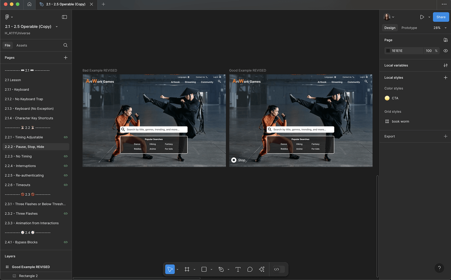
Learners experienced a micro-learning challenge once they reached the "Explore" page of each guideline.
My team knew this project would be content heavy. I collaborated with our development team to design template pages and create an a admin panel. This allowed me to build the content out for all 4 galaxies, 13 solar systems, and 86 planets with ease.


